Case Study
Rumax Limited
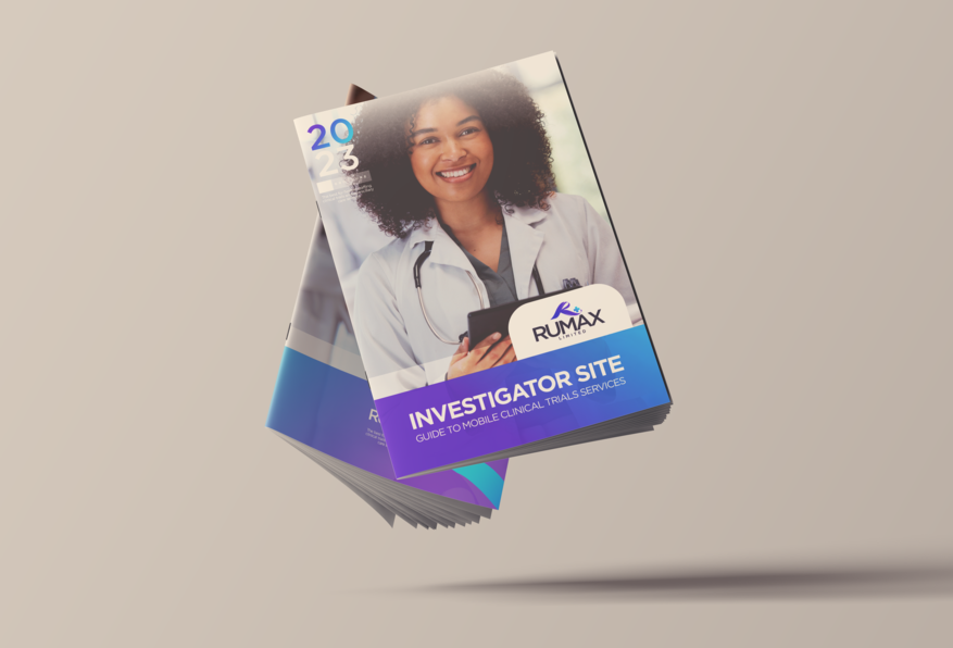
Founded in 2010, RUMAX Limited is one of the UK’s most trusted care providers for patients and clients, delivering comprehensive and compassionate health and social care services. Their core offerings include cutting-edge mobile clinical trial services, investigator site support, domiciliary care and supported living services. Rooted in principles of compassion, mutual respect, honesty, teamwork, and a commitment to improving a client’s quality of life, they’ve earned a prominent place in the health and social care industry.
Brand Identity
The increased ageing population and life expectancy in the United Kingdom have led to more established care homes, Experian Market IQ (2021). The residential nursing care market grew by 1.4% per year between 2016 and 2021 to an estimated £7.7 billion, according to Experian Market IQ. The increasing demand for more care facilities drives new and established businesses to look for novel ways to reposition themselves in the market.
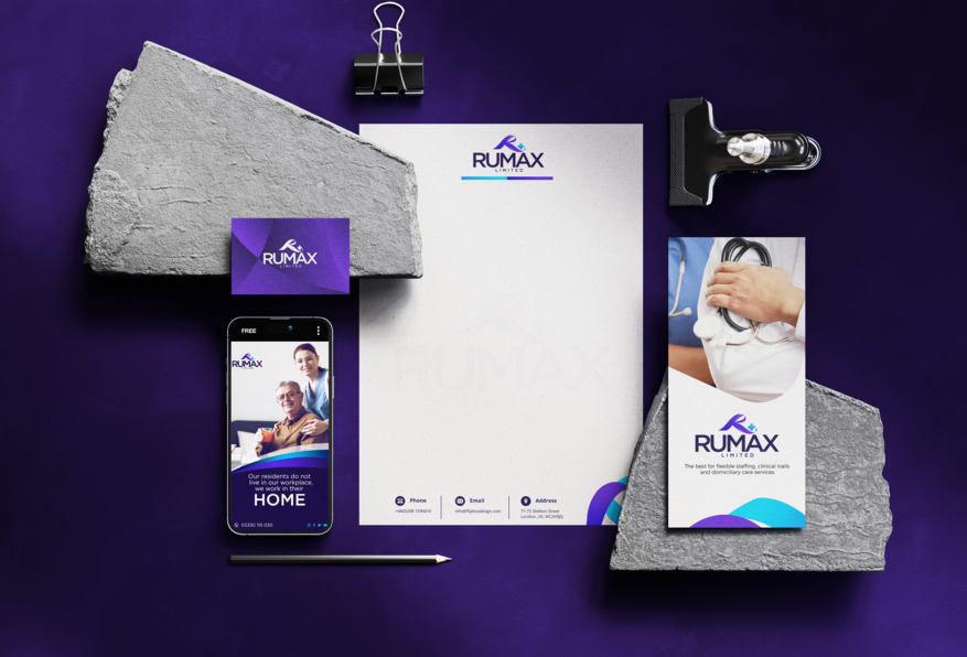
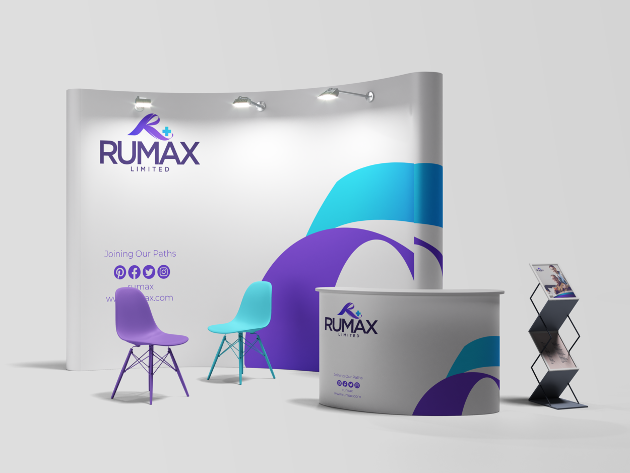
Rumax approached Flipbox to rebrand its organisation. It has had branding for the past 13 years but must be defined regarding the logo and colour palette. The Flipbox design team created a new visual identity, including a logo, typography, colour palette, and graphic language. These all function together to create the newly rebranded Rumax Limited.
We completely revamped Rumax’s branding colour palette, making significant enhancements and changes. Our primary objective was to infuse the brand with new energy and vitality. The previous colours used by Rumax needed to be more muted and capture the brand’s dynamic and vibrant spirit.
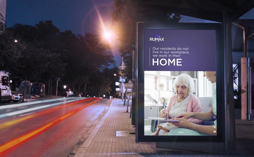
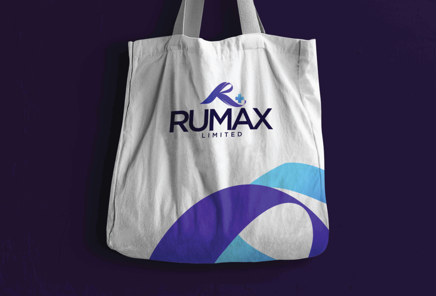
The Rumax logo is easily recognisable with its unique letter R design that resembles a helping hand, with a cross that reflects the company’s area of specialisation – medical-related services, specifically clinical trials. Underneath the stylised R, the letters RUMAX are written in uppercase. Overall, the logo represents the brand identity and conveys the industry in which Rumax operates. The new identity is focused on the use of colour. The colour scheme combines modern, bright, and warm colours. Muted shades have also been incorporated to balance out the vivid colours. This enables the creation of adaptable colour combinations that are easily recognisable across Rumax and the brand assets developed by the Flipbox team.
The Rumax Website
Rumax Limited had a website in place, but after rebranding Rumax’s brand identity, the Flipbox Design team shifted their focus to the website. The company had two websites running simultaneously with different information as copies about the organisation. Despite having two websites in place, neither website’s user journeys were considered, there was no call to action, and the entire website copy was not structured in a user-friendly manner. Flipbox’s UI/UX design team took down both websites and created a more user-friendly and aesthetic website.
Some of the key features on the website include a quick contact form on the right side of the home page banner to enable users to act immediately if needed without having to click the ‘’our contact’’ page on the website header. We immediately put short descriptions of Rumax’s four primary services just below the main home page to give users a quick overview of the services without visiting the main service section. The entire website stays true to Rumax’s brand identity and colour palette. The previous websites were not mobile user-friendly, which the design and development team took seriously.