Enice Training & Care is a UK-based organisation specialising in training Care Givers across the UK.
Flipbox has recently crafted a fresh and captivating identity for Enice Training & Care to create a powerful and easily identifiable brand for the organisation. This new identity aims to foster stronger connections with caregivers in the UK and to rekindle enthusiasm in the care industry.
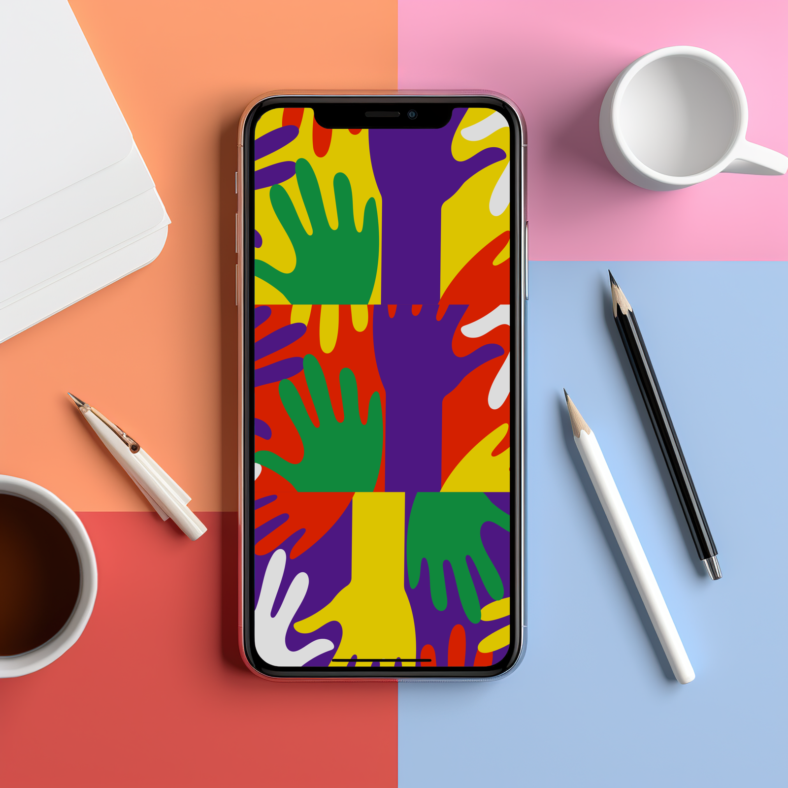
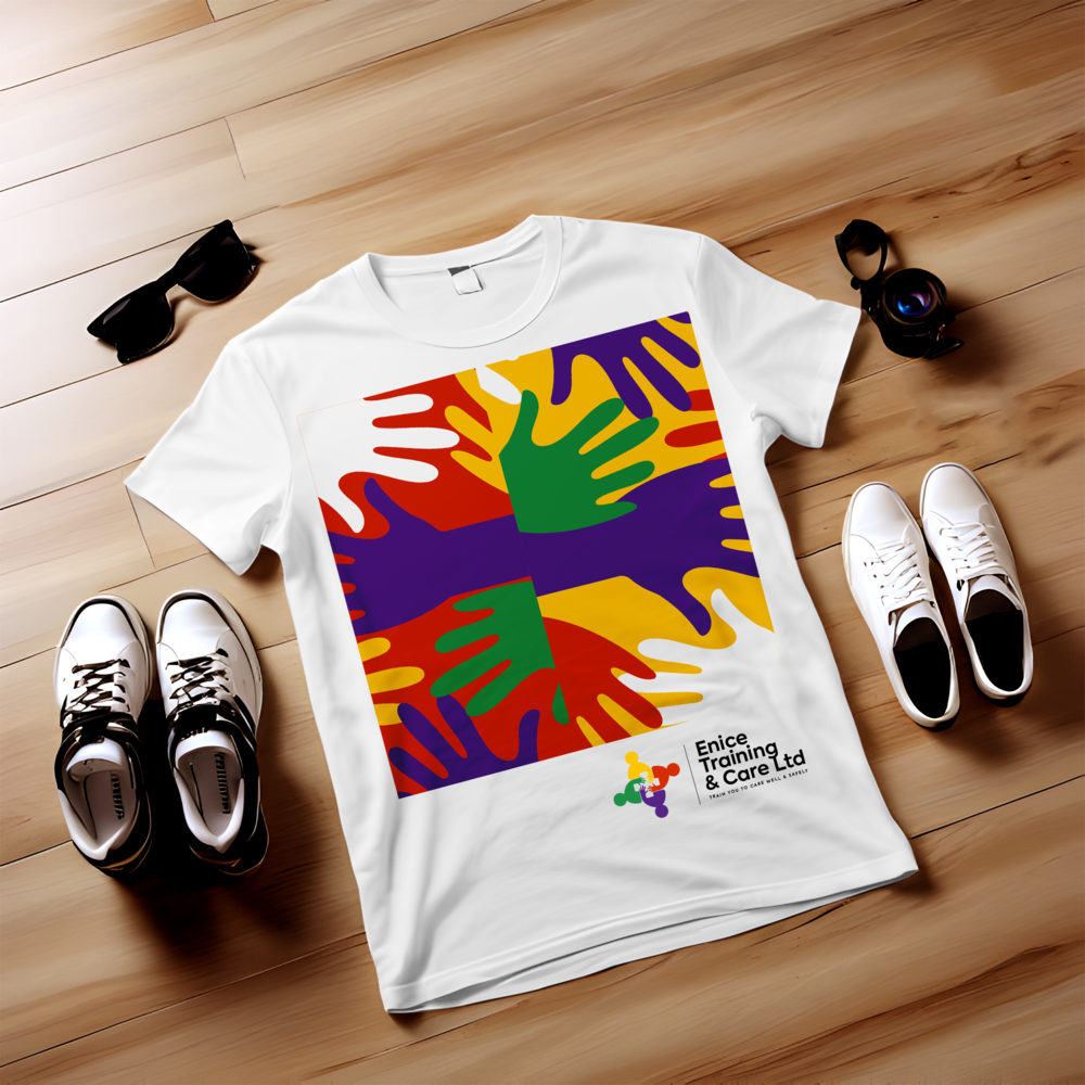
The ETC Identity, with its internationally recognised visual symbols, not only communicates areas of specialisation but also fosters a welcoming and collaborative environment, where everyone is focused on a singular objective.
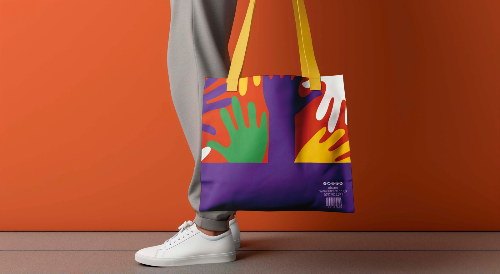
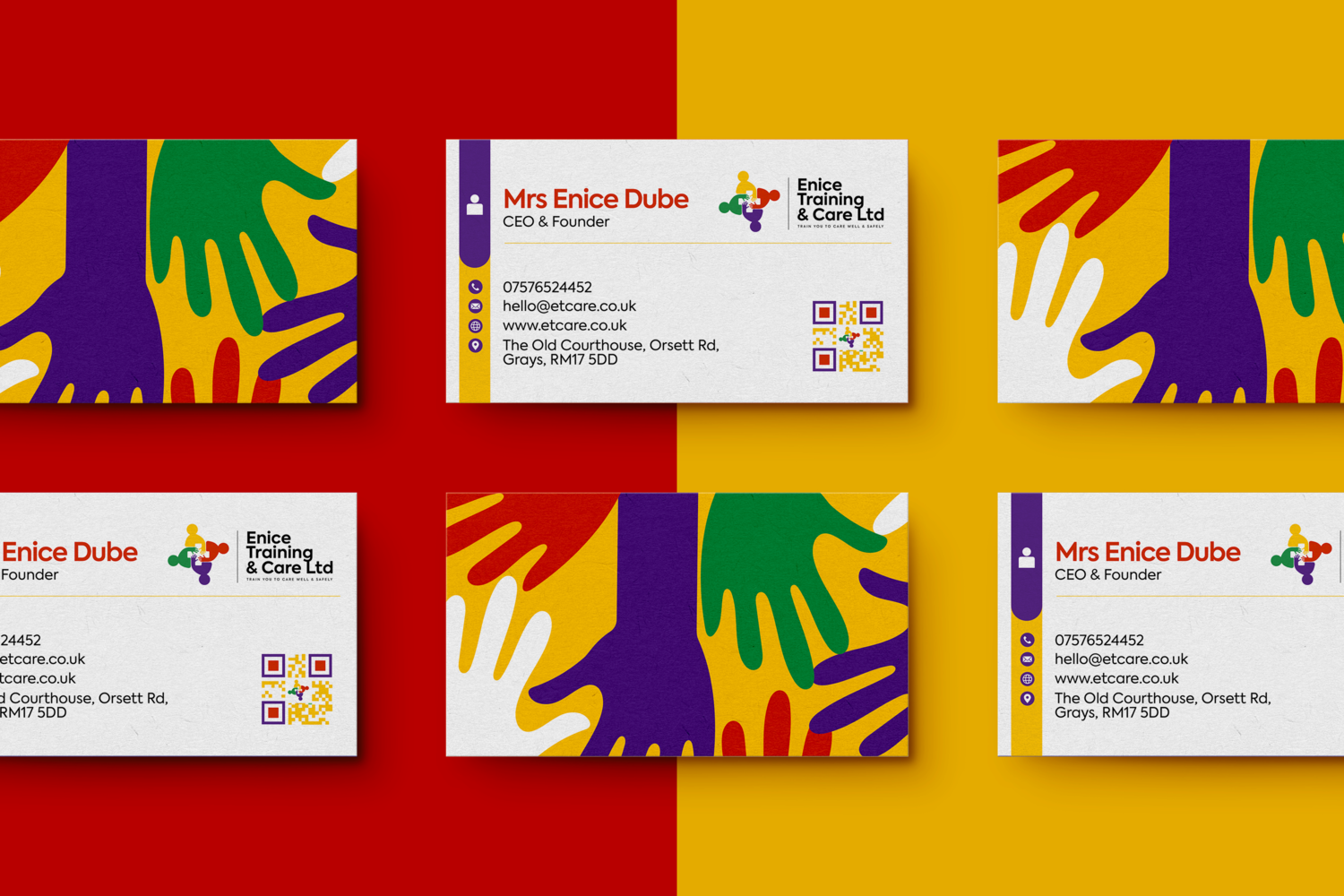
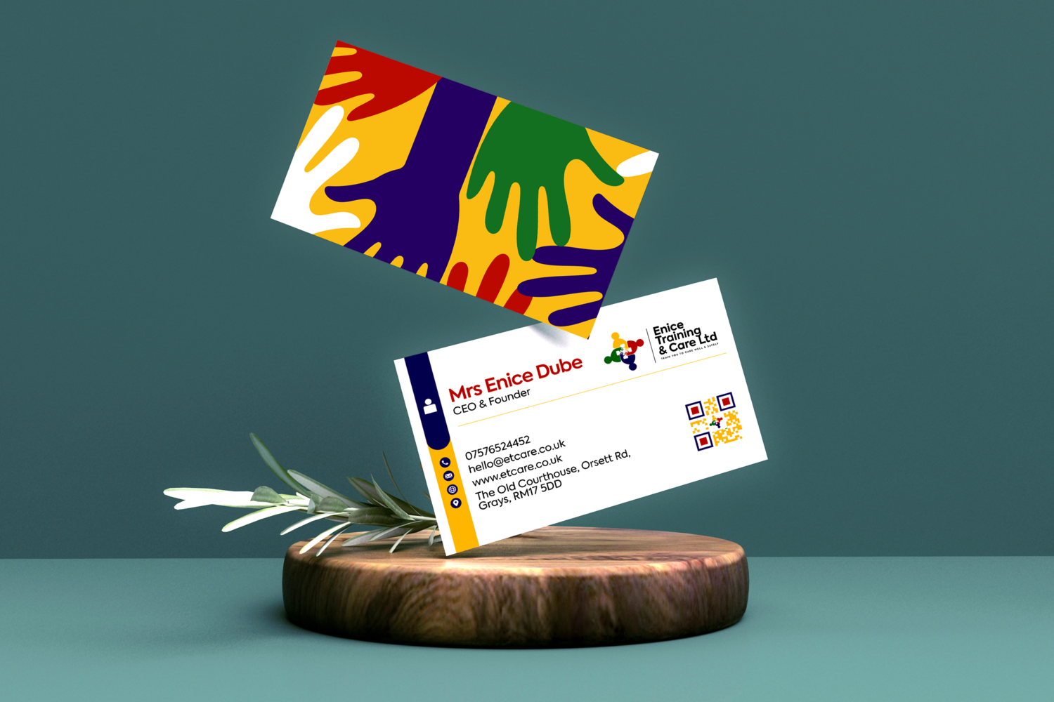
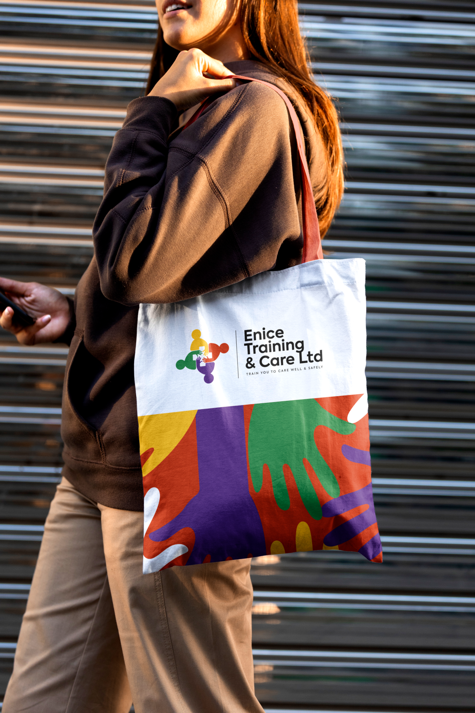
The logo, featuring graphic icons of trainees’ hands put together, forms a Red Cross symbol that is internationally recognised in the health sector, reinforcing our credibility and trustworthiness.
The vibrant colour palette brings ETC’s brand Identity to life. The major challenge in crafting the organisation’s brand was distinguishing it from a care agency and, most importantly, visually communicating with the target audience as a training centre, not a care agency. We implemented the brand identity across ETC’s collateral materials.
Our team also designed and developed a website for Enice Training and Care. Visit website.